

Administrative Unit Assessment Data Visualizations
Administrative units are required to annually assess their performance by gathering relevant information, reflecting on that information, and then using that information for improvement. Each unit prepares and submits a report of the assessment and improvement activities conducted within that unit over the course of the previous academic year. These reports are submitted to Institutional Effectiveness, which provides feedback on each report and then archives that report.
The administrative unit assessment process begins with the identification of clearly defined, measurable expected outcomes that align with a unit’s stated mission and support the university’s overall mission and purpose. Assessment activities and measures that will assess performance relative to the expected outcomes are identified; annual targets are set based on these measures; and results are analyzed and evaluated based on these targets. The units then use these findings to develop direct and applicable action plans to drive improvement.
Data Visualizations
Interactive visualizations have been created for individuals who are interested in further exploring administrative units’ assessment data. The visualizations below show results for admirative unit outcomes and student learning outcomes collected during the 2019-2020 assessment cycle. The pie chart in the visualizations illustrates the number of administrative unit outcomes (AUOs) across all units, as well as the percentages of those AUOs with met, partially met, or unmet targets. In interpreting the pie chart, please note that the determination of outcomes being met, partially met, or not met is not an indicator of unit quality. Units select their own targets, which means a target may not be met because the unit has set a particularly challenging target in order to drive improvement.
As indicated below, 109 administrative units measured a total of 861 AUOs; targets were met for 67.5 percent of unit outcomes in all concept areas. The bar graph on the right shows the results of AUOs by the measurement methods used by the various administrative units.

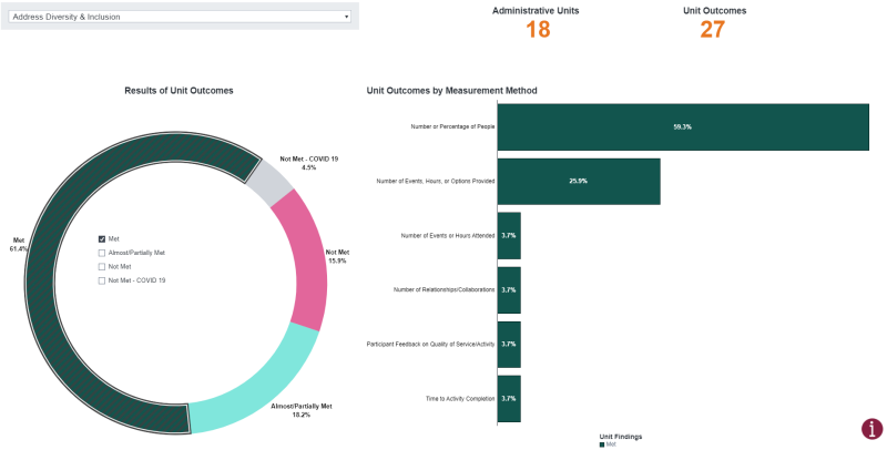
The interactive visualizations also allow users to explore findings for each concept area by selecting a concept area in the drop-down menu and checking the boxes at the center of the pie chart. For example, the visualization below shows 18 administrative units measured a total of 27 unit outcomes related to Diversity and Inclusion. Targets were met for 61.4 percent of unit outcomes. Furthermore, the 59.3 percent of the unit outcomes that were met were measured using the Number or Percentage of People data.
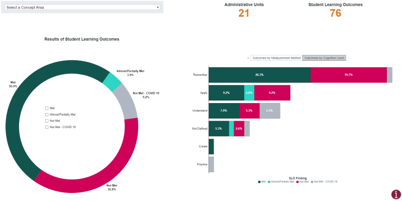
Visualizations are also provided for administrative units’ student learning outcomes by clicking the second tab titled Student Learning Outcomes. The student learning outcomes specify the key knowledge, skills, and competencies that students should know, have, or be able to do. In addition to student learning outcomes by measurement method, the right bottom bar graph shows student learning outcomes met by cognitive level. Each of the student learning outcomes was classified into a specific cognitive level based on Bloom’s Taxonomy. Bloom’s Taxonomy is a framework often used in teaching and learning to classify learning outcomes based on their level of complexity. The example presented below shows that 26.3 percent of the student learning outcomes that were met across all concept areas were at the Remember level of Bloom’s Taxonomy.
Please visit our interactive visualizations to explore additional information related to administrative unit and student learning outcomes.